How to choose paint colors and finishes
A color that looks right on the chip often looks wrong on the wall. Testing it in your own light, and matching the finish to the room, is what gets it right.

A paint color almost never looks the way it did on the chip once it is on your wall. The light in the room, the surfaces around it, and the finish you choose all change how it reads, which is why the same gray can look warm in one house and cold in another. Choosing well is less about picking a favorite color and more about testing it where it will actually live.
This guide walks through the things that decide how a color turns out: the light in your room, the undertones hidden in whites and grays, how to test properly, and which finish suits which surface. It ends with a simple order of decisions so the choice does not feel overwhelming.
Start with the light in your room
Light is the biggest influence on how a color looks, and it changes room by room. North-facing rooms get cool, bluish daylight that makes colors look flatter and grayer, so warm shades often sit better there. South-facing rooms get warm, generous light that can make the same color look brighter and more saturated than you expected.
Artificial light shifts things again. Warm bulbs push colors toward yellow, and cooler bulbs toward blue, so a color chosen in a bright shop can look wrong under your own lamps at night. Because the light differs in every room, do not assume a color you liked in one room will behave the same in another. Judge it in the room it is meant for.
Understand undertones
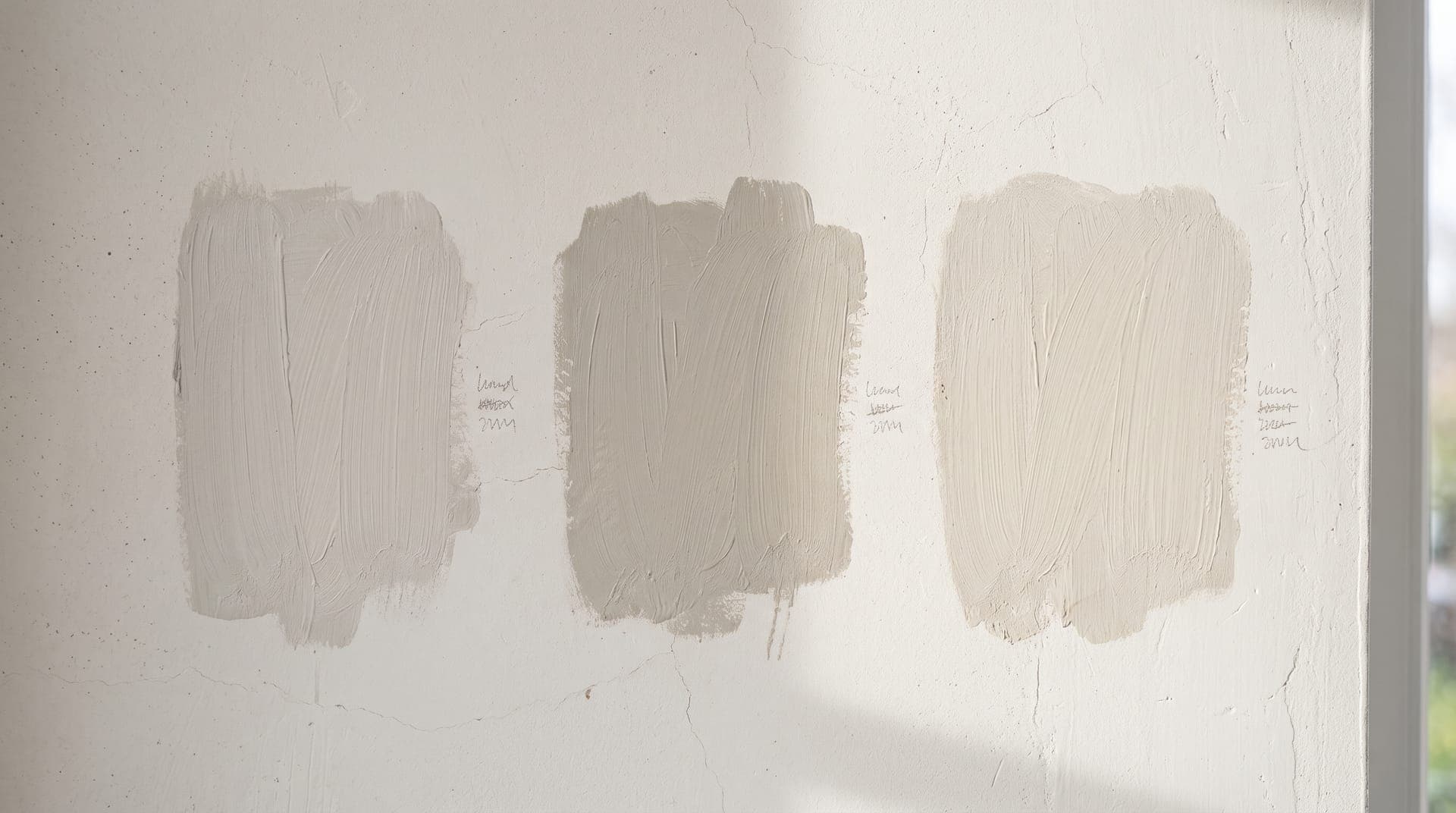
Few whites are truly white and few grays are truly neutral. Most carry an undertone: a faint lean toward green, pink, blue, or yellow. On a small chip you may not notice it, but across a whole wall, and especially next to your trim and flooring, it shows clearly. A gray with a blue undertone can read cold and almost lilac beside warm oak floors.
The way to see an undertone is to compare. Put the color next to a sheet of pure white paper, and next to the other colors it will live with, such as the skirting, the floor, and a large piece of furniture. The undertone that was invisible on its own becomes obvious in company. Choosing colors with undertones that agree, rather than fight, is most of what makes a scheme feel settled.
Test before you commit
Never commit from a chip or a screen. Buy sample pots and paint test patches as large as you can, ideally a square of at least two feet, on more than one wall. Better still, paint a large piece of board or lining paper you can move around the room, so you can hold the color against the window, the darkest corner, and your furniture.
Then live with it. Look at the patches in the morning, at midday, and after dark under your own lights, because a color that looks right at noon can turn cold or muddy by evening. Leave the samples up for a few days before deciding. This is the step people most often skip, and the one that prevents the most expensive mistakes.
Choose the right finish
The finish, or sheen, matters as much as the color. It changes how the paint looks, how well it hides flaws, and how easily it wipes clean. A flat color on a kitchen wall will mark within a week; a glossy color on a lumpy wall will show every bump.
| Finish | Look | Best for |
|---|---|---|
| Matte / flat | No shine, soft and velvety. Hides bumps and patchy walls well. | Ceilings and low-traffic rooms. Marks easily and is hard to clean. |
| Eggshell | A low, subtle sheen. More forgiving to clean than matte. | Living rooms, bedrooms, and hallways that need the odd wipe. |
| Satin | A soft, gentle gloss that reflects a little light. | Kitchens, bathrooms, and busy walls where you need to wipe marks off. |
| Semi-gloss | Noticeably shiny and hard-wearing. Shows wall flaws more. | Trim, doors, skirting, and damp rooms. Wipes clean easily. |
| Gloss | High shine, almost reflective. Tough but unforgiving of surface flaws. | Woodwork and features where you want a hard, washable finish. |
Put a palette together
A room reads as calm when its walls, trim, and ceiling relate to each other. A common approach is a wall color with trim a few shades lighter or a crisp off-white, and a ceiling lighter again, all sharing the same undertone. Colors that share an undertone sit together without any one jarring.
Think about the whole home, not one room at a time. Carrying a thread of color through connecting spaces, a hallway that picks up the trim color of the rooms off it, makes a home feel considered rather than a set of unrelated boxes. And limit the number of colors. A handful used consistently looks more deliberate than a different scheme in every room, and it is part of planning simple home improvements that add up.
Mistakes to avoid
- Judging a color from a tiny chip. It looks lighter and less saturated than it will across a whole wall.
- Ignoring undertones, then wondering why a "neutral" gray clashes with the floor.
- Matching to a color on a screen, which shows light differently from paint and varies between devices.
- Choosing the wrong finish, such as flat paint in a kitchen that then will not wipe clean.
- Buying all the paint before testing, instead of sampling first and committing once.
How to test a color properly
- Paint at least a two-foot square, on more than one wall, or on a board you can move around the room.
- Leave it up for a few days rather than deciding the moment it dries.
- Look at it in daylight and at night under your own lights before you decide, since both change the color.
Questions about choosing paint
Should a small room be light or dark?
Light colors reflect more light and make a small room feel more open, which is the safe choice. But a small room is also a good place for a deep, enveloping color, since you are not trying to make it feel vast. A dark room can feel cozy and intentional rather than cramped. Either can work, and there are other ways to make a small room feel bigger that do not depend on color alone.
How many colors should I use across a house?
Fewer than most people expect. A small palette of two or three wall colors, plus a shared trim and ceiling color, carried through the house looks far more coherent than a new scheme in every room. You can vary the mood room by room with furnishings rather than with the wall color.
Can walls and trim be the same color in different finishes?
Yes, and it is a popular, quiet look. Using one color in a matte or eggshell finish on the walls and a satin or semi-gloss on the trim gives a subtle contrast from the change in sheen alone, without introducing a second color. The woodwork reads as distinct up close but the room stays calm.
A simple order of decisions
Start with the light the room gets, which narrows warm against cool. Check undertones against your floor and trim. Test large patches and live with them for a few days in different light. Then pick the finish to match how the room is used. Taken in that order, the choice stops being a gamble, and the work of painting a room properly pays off on a color you are sure of.
This guide is general information. Homes, materials, and local rules differ, so check product instructions and the regulations where you live. Read the full disclaimer.